vitaminwater — Rebrand
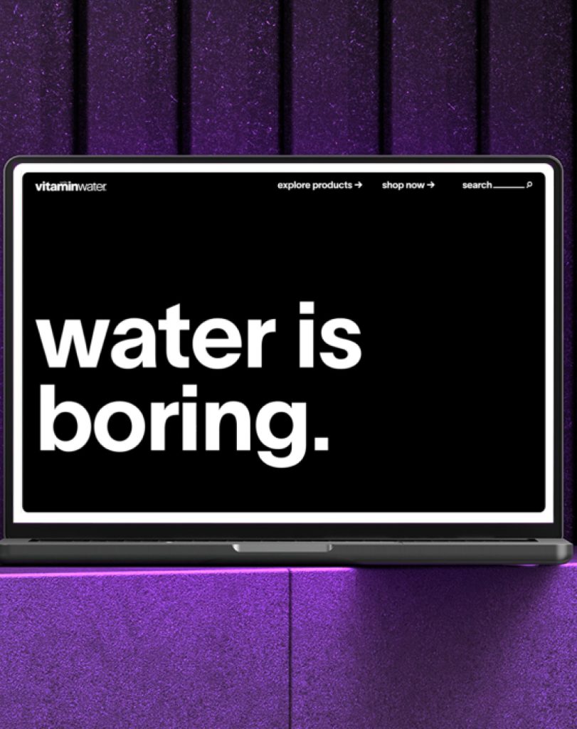
How can water have attitude?
By bottling raw NYC, and making water your partner in crime.
Shared impact
864M Earned media impressions after new launch.69% boost in shelf find-ability with new package.
72% increase in overall preference for the new design.
We worked with the team to reignite that energy, refreshing its identity with bold design, wit, and attitude to reconnect with a new generation of drinkers.
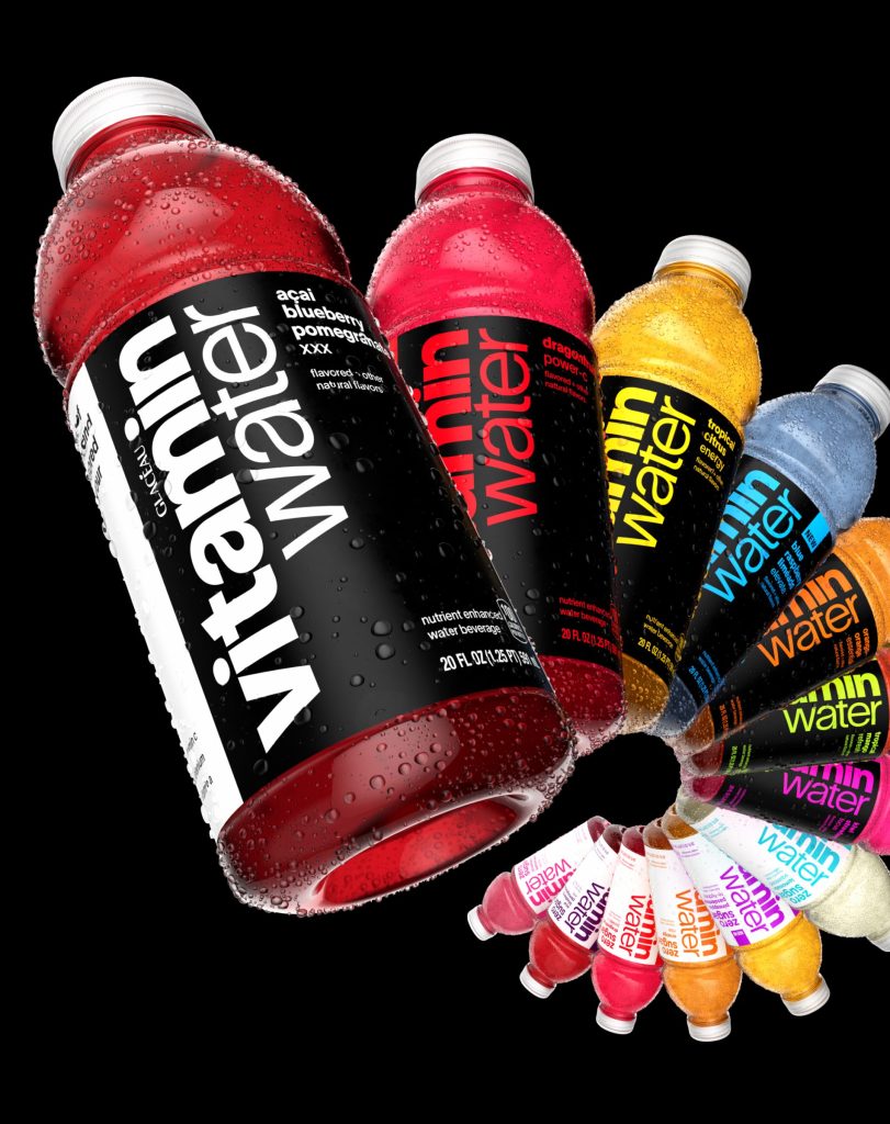
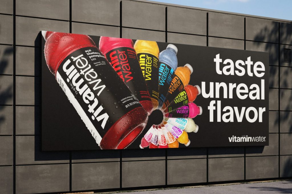
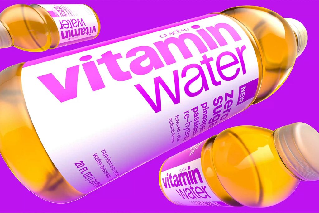
Packaging that
shouts flavour first.
Once cluttered and clinical, vitaminwater packaging had started to feel more like medicine than a moment of joy.
We stripped it back to let flavour take centre stage. Out went the noise, and in came a clean new front face built for maximum shelf shout.
A stacked brandmark makes its presence known from a distance, while full-bleed labels and a punchy two-colour system turn every bottle into a flavour beacon.
The result?
Packaging that’s anything but boring.
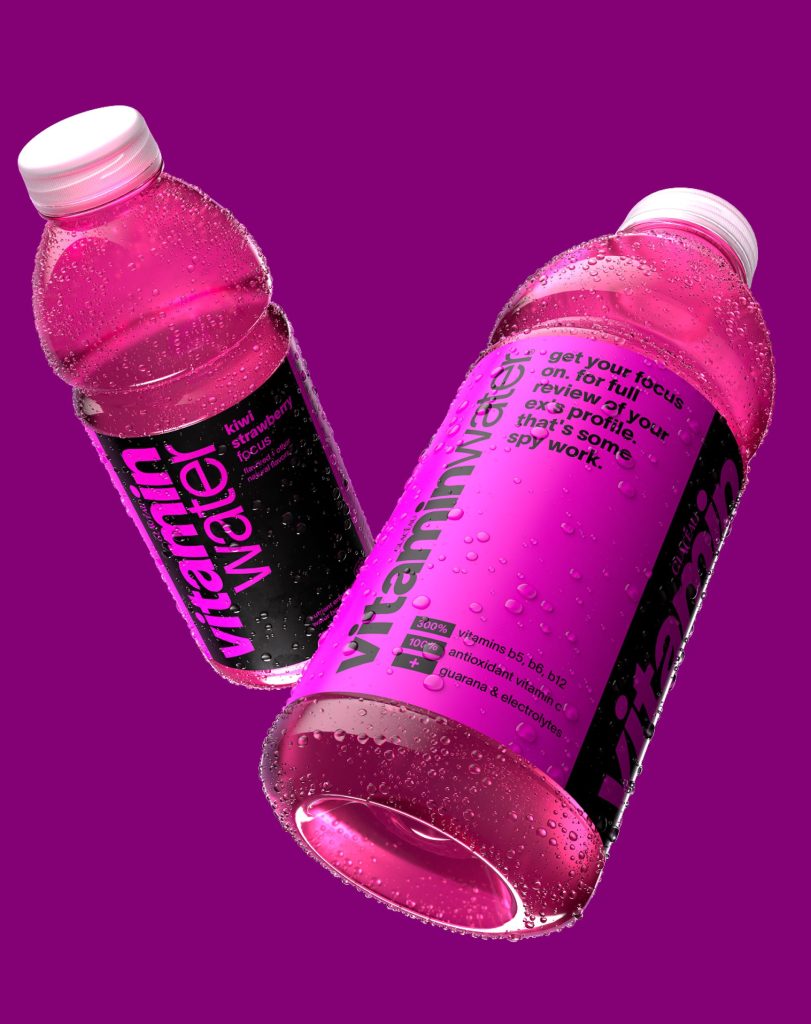
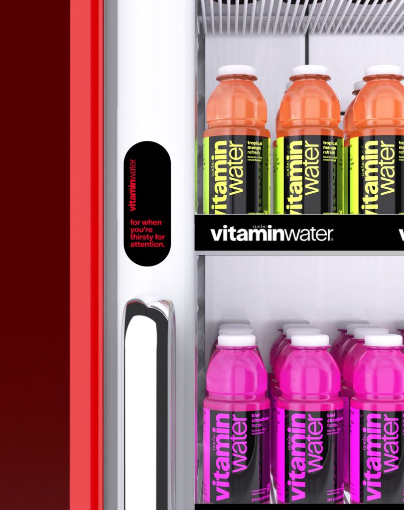
Messaging with an
attitude to match.
Wellness drinks often talk down to people, drowning in jargon and empty promises.
We flipped the script with a voice that’s straight-talking, irreverent, and unapologetically ‘New York’.
No more claims of “boosting immunity” or “cognitive benefits”. Instead it’s lines like “Immunity from all the BS” or “Focus: time for a full review of your ex’s profile.”
This messaging celebrates individuality, ditches the wellness clichés, and brings a dolce vita(min) attitude to every bottle.

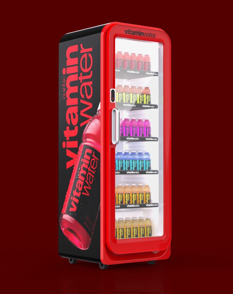
A global system
that owns the aisle.
What started on pack now powers a unified identity across every touchpoint.
Built to cut through in the shopper environment, the system uses vibrant colour, confident typography, and our witty voice to grab attention fast.
Designed for global rollout with local flexibility, the system enables an instantly recognisable and consistent look worldwide, setting the brand up with guardrails strong enough to last the next 20 years.
Vitaminwater had lost its edge, blending into a crowded hydration aisle and feeling more clinical than cultural.
We went back to its New York roots and rebuilt the brand with bold design, unapologetic attitude, and flavour-first packaging to make it stand out once again.
View Project Sprite
How can you manifest iconicity?
Coming Soon House of Coca-Cola
How can anyone taste the world?
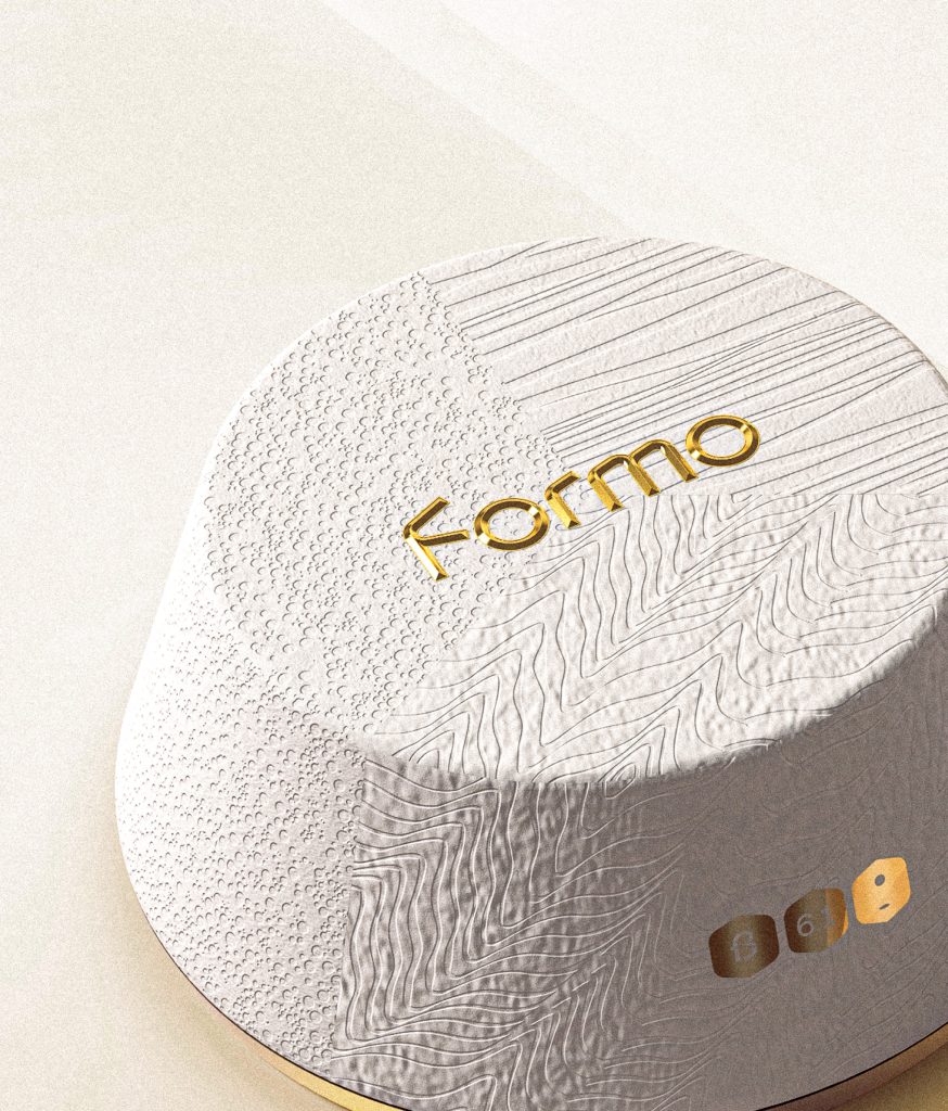
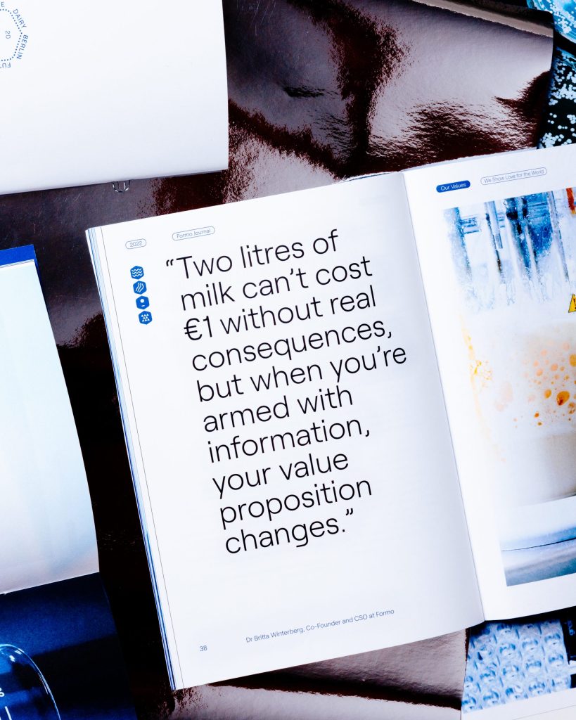
View Project Formo
Will cheese ever be sustainable?
- Curious about who we are?
- Or how we could work together?
- What else we've been up to?
- Or even what we're thinking?
